In the previous post I mentioned raising a pull request to AWS with my version of log analysis. I received first feedback, including that from myself.
The issues I was aware of were:
- broken timestamp handling in evaluation notebook (also reported by luiscosio in the community channel, thank you!)
- slow training progress analysis
- sloooooooooooow plotting of evaluation laps
- smaller things here and there
I decided to improve them before the pull request is considered by AWS.
Timestamp handling
This one was easy. I changed the float value of timestamp to a Decimal and this one is not handled well. The reason for the initial change was to force proper formatting of timestamps (the scientific notation isn't very useful when looking at them). I guess there is some way to just display them properly, I'll look it up.
In evaluation however even properly formatted timestamp is not very useful and human-readable date would be far more convenient - it's purpose is to give an idea when a given evaluation happened.
This can be fixed with use of pandas.todatetime method which just provides nicely readable date and time. View the change - key fix in line 371.
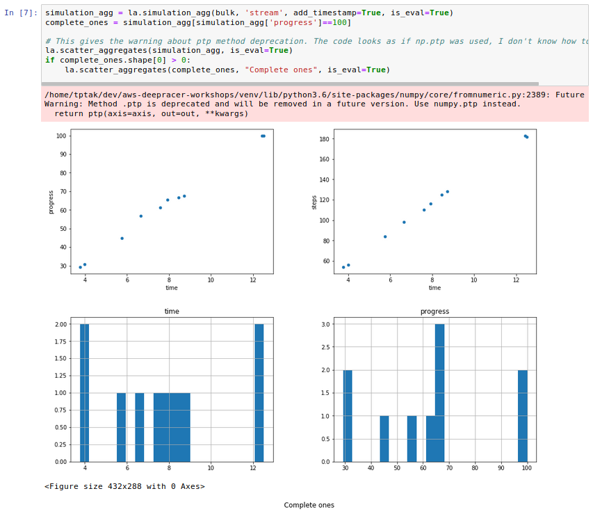
While I was digging around, I realised that evaluation doesn't need many of the graphs plotted for the aggregated laps: reward only shows how far from the centre a car is, new_reward is pretty much pointless as we cannot train against the track. Also all the graphs with relation to the starting point become meaningless.
I have therefore removed them for evaluation and only left for training.
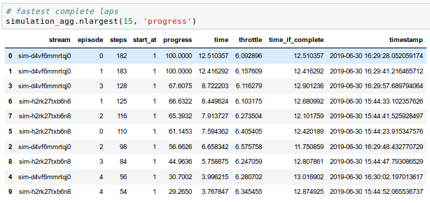
Training progress analysis
It was one of the first sections in the notebook that I started expanding. It was easy to get some initial understanding and to add things in, but with time it grew into 130 lines of code that took forever to run.
While finishing off the blog post for a pull request, I realised that most of the info was already available in the aggregated version of the dataframe and it worked much faster. I decided to try and pandalise this code.
First of all I don't think pandas work well with iterations. I mean they probably do, but not as well as when one employs the more declarative way of preparing data in the dataframe. Half an hour of googling later I had most of the graphs rewritten into pandas, only those related to completed lap time and completion rate were not ready.
The first one I solved by filtering the complete laps and leaving out the iterations that had no complete laps (instead of showing them as zero as in previous version).
With the last one I struggled a bit as I am not too confident about working with counts within groups. I decided to work around the issue:
aggregates['complete'] = np.where(aggregates['progress'] == 100, 1, 0)
With a column of ones for complete laps and zeros for the rest, the problem is brought down to calculating mean value on aggregates grouped by iteration:
complete_per_iteration = grouped['complete'].agg([np.mean]).reset_index()
I haven't run time comparisons but the speed change I observed was so big that I put all the plotting calls into a single code block to reduce amount of clicking since waiting is not an issue any more.
And the code got reduced to 50 lines. See the change.
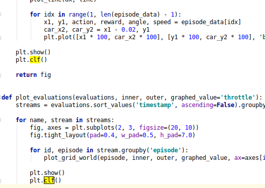
Plotting evaluation laps
I avoided plotting the laps unless absolutely needed. It could take about a minute to plot one lap - ridiculous.
I looked at the code to understand what was so costly in there. In the 90 lines of code first a loop was used to calculate values to put in the title, then a nested loop is used to pretty much prepare a bitmap of a pixel by pixel setup of values which then are fed into imshow function which shows a pretty picture from those.
I thought that maybe we could sacrifice some of the pretty bits of the visual side to make it an enjoyable user experience.
First of all I updated the code to rely on minimum progress to choose what to plot - much more meaningful and track agnostic than an arbitrary route length.
Then I reused bits of the code for plotting the track bounds and removed the polygon calculation code and also checking if a pixel is on track. This:
        for y in range(max_y - min_y):
            for x in range(max_x - min_x):
                point = Point((x, y))

                # this is the track
                if (not inner_polygon.contains(point)) and (
                        outer_polygon.contains(point)):
                    grid[x][y] = -1.0

                # find df slice that fits into this
                df_slice = episode_df[
                    (episode_df['x'] >= (x + min_x - 1) * scale) & (
                            episode_df['x'] < (x + min_x) * scale) & \
                    (episode_df['y'] >= (y + min_y - 1) * scale) & (
                            episode_df['y'] < (y + min_y) * scale)]

                if len(df_slice) > 0:
                    # average_throttle = np.nanmean(df_slice['throttle'])
                    grid[x][y] = np.nanmean(df_slice[graphed_value])
gave way to this:
        ax.set_facecolor('midnightblue')

        line = LineString(inner)
        plot_coords(ax, line)
        plot_line(ax, line)

        line = LineString(outer)
        plot_coords(ax, line)
        plot_line(ax, line)

        episode_df.plot.scatter('x', 'y', ax=ax, s=3, c=graphed_value, cmap=plt.get_cmap('plasma'))
I also did some cleaning up around spacing of the plots and the header. I removed prints from the code as they are not in synch with displaying the graphs - headers contain all the info.
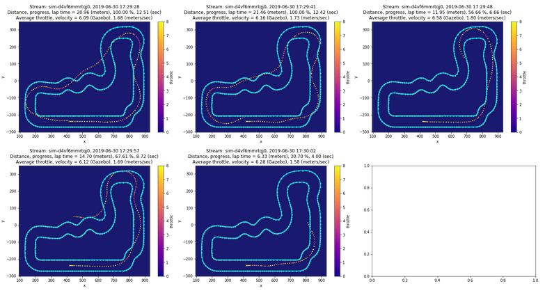
The new code is about 40 lines and takes a few seconds to generate the plot. In fact, it's so fast that I remove the default minimum distance/progress completely and replaced it with plotting each evaluation, all five laps of it. With five evaluations it takes around 15 seconds for the first one to appear and 5 seconds more for all of them to be displayed. See the change.
Remaining problem
I tried to fix some of the warnings that matplotlib is serving. I started closing the plotted figures and stuff, but some of them I don't understand enough to fix. If you know pandas, matplotlib and all that wonderfulness in code, please help. I don't want red warning boxes in the output of these notebooks.
DeepRacer news
Alex Schultz prepared his own approach to working with a local training environment: Start training DeepRacer locally with a single script. There's a lot of work to prepare local training for various environments: Windows is in progress, some are using AWS EC2 Spot instances (which I heard are cheaper than the console). Sadly ARM architecture is a pain to do it on, maybe one day.
In the meantime AWS DeepRacer team have updated the solution behind the AWS DeepRacer Console to cut the costs by about $1 per hour. I haven't tried it yet, but it sounds promising. Read the announcement on the DeepRacer forum.
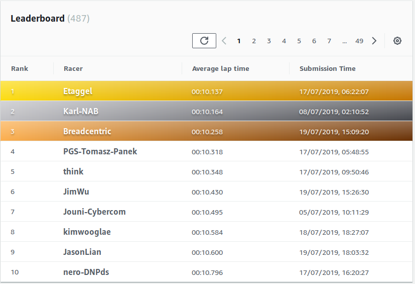
In the current race, Empire City Circuit, I'm currently third with 10.258s. I'm pleased to report that with 11 days to go, the top four of the standings are people from the community.
Community
I'd like to thank our AWS DeepRacer Community for all the helpful feedback and suggestions. You can join us and learn to train your car at http://join.deepracing.io. A webpage with resources is coming!